New data, and good news!
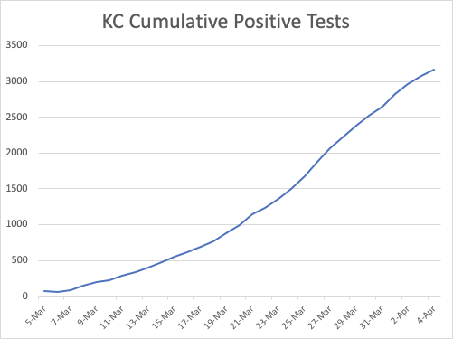
One reason the graphs up until now have been somewhat “jumpy” has been that each day I enter their new number, do some simple math, and get a curve. This was always right eventually – on average – but sometimes KC took tests they added today and put them into past days when the tests were administered. This meant I had the right number of positives, but they were sometimes assigned to the wrong days. Today I went back and corrected all the data, and it now looks much smoother.
My one complaint today is that they haven’t updated their total test number. I use this as an indicator if we start to see a jump, since more tests likely means more positives.
Looking at the cumulative positive test curve, we see a nice bending curve, just as we would hope. Eventually we need to see this level off but I’ll take this. You can see we are on the way, and for reasons I’ve outlined elsewhere this may take a long time to truly level out even after we’re essentially adding no new cases.
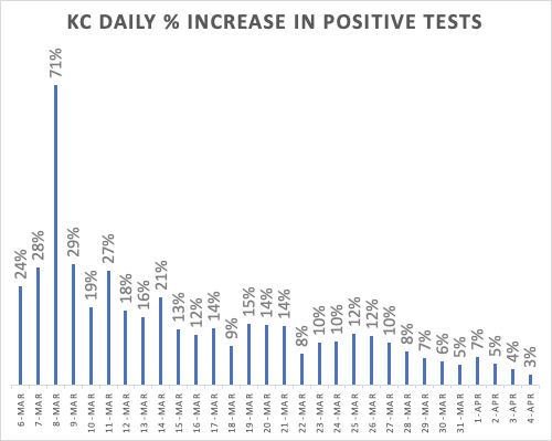
The percent increase in positive tests is where the action is. Look at that curve! This “first derivative” graph shows a consistent downward trajectory. Look at how far we’ve come! From an early average of 20% – 30%, doubling every 3-5 days, we’re now down below 5% and falling. This is the kind of data that must have helped Inslee make the decision that we had a surplus of ventilators so he could send 400 to New York where they are badly, desperately needed.
It’s interesting to consider where we’d be had we not social distanced and slowed the curve. Let’s imagine we’d just “let it rip” back on March 14 with 388 cases, but then kept growing at the natural rate of 18%. Today we’d be celebrating 15,000 cases in KC, putting just King County in 5th place vs. the other states – just behind California. We’d have been right up there with New York in per capita infection.
Our death curve growth rate is similarly slowing. Not as fast as infections – which we’d expect since any impact on deaths will lag infections – but still we’re making real progress.
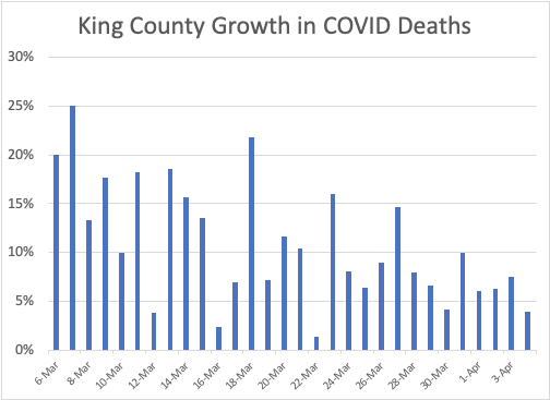
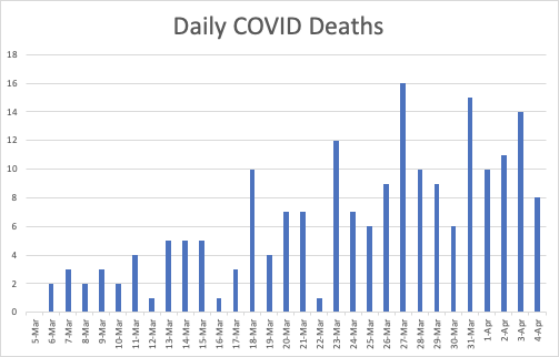
Looking at raw daily deaths and eyeballing it – which I should never do – I’m ready to declare prematurely we’ve leveled off our daily death rate at around 10 per day. No, I shouldn’t do that, but you can see where my optimism comes from.
Now let’s take one more look at the University of Washington model of our state’s progress on COVID vs. our medical resources. Two days ago, our model showed we’d need 2342 beds at peak, 350 ICU beds with a shortage of only 9 ICU beds and 280 ventilators. Our Peak was scheduled to arrive April 11.

With our updated data and trends, we’ve dramatically shifted things. We are passing our peak utilization right now, and are predicted to have plenty of ventilators, plenty of ICU beds, and plenty of hospital beds. Congratulations!

Now, let’s be clear: This entire model is based on the assumption we now keep up the distancing! COVID is still out there among us – on the shopping carts, in our population, and apparently maybe in our cats. If we all go back to our old behaviors now, we’ll almost certainly shoot back up to 20% growth rates and be right back where we started. We absolutely must keep this up through the end of the curve, currently around May 01. And then opening up will be one of the trickiest, most cautious, scariest things we as a community will ever do.

I’m reaching the same conclusions about King County, with slightly different analysis of the same data. I’m doing trailing 7 day averages, which smooths things out and corrects for day of week effect, and I’m seeing the infection rate drop by about 10% from the peak, and the death rate stable within a narrow band of 61-67 deaths per week, every day for the last 8 days.
LikeLike